|


Click
here
to sign
up for our FREE
e-newsletter!

|
Newsletter Design

Justified or
Ragged Right?
How to Choose
We see justified text almost every
day—in newspapers, magazines, and books. It is the most common form of
text alignment in use today for publications. But would it work well for
your newsletter? Studies have been done to try to pinpoint which type of
alignment increases readability. There is no conclusive evidence to show
which is preferred by readers. In fact, you can find studies that promote
justified text as being more readable and others that say that ragged
right text increases speed and comprehension.
So it most often comes
down to the preference of the newsletter producer. When deciding what type
of text alignment to use, you should consider these points first.
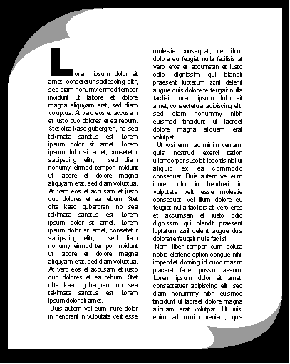
Justified Text
Justified text is text that aligns
on both the left and right side of a column.
| Advantages
of Justified Text |
|
Disadvantages
of Justified Text |
 |
More
formal. |
|
Familiar
to readers. |
|
Cleaner
look. |
|
Maximizes
word density and allows you to fit more text in less space. |
|
Considered
by some to increase comprehensibility. |
|
|
|
Less
friendly. |
|
May cause
excessive use of hyphenation unless care is taken. |
|
May cause
"rivers" of white space in the text. |
|
May
take more time to layout properly, by requiring more extensive
manual editing. |
|
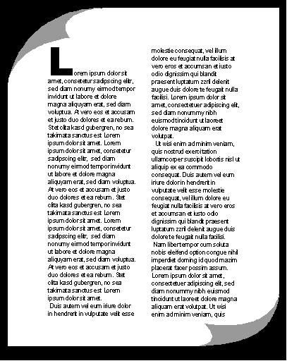
Ragged Right Text
Ragged right text
is text that aligns on only the left-hand side of a column, leaving the
right side jagged or “ragged.”
| Advantages
of Ragged Right Text |
|
Disadvantages
of Ragged Right Text |
|
Casual
and open look. |
|
Increases
white space. |
|
More
appropriate spacing between letters and words. |
|
Can
speed up reading rate. |
|
Generally
considered easier to read. |
|
Takes
up less of your time to layout properly. |
|
|
|
Not
as familiar to readers of books, newspapers and magazines. |
|
Can't
fit as much information into each column. |
|
May
need extra editing attention to prevent the right edge from
becoming too ragged. |
|
The Final Decision
Ultimately, it comes down to a judgment call. A formal, investment banking
newsletter would probably benefit from the look of justified text. An
apartment community newsletter should probably be set using ragged right
alignment. But, as with all design "rules," there aren't any
that can't be broken. Go with what looks good to you, and you will
probably find that your readers will agree! Ask for input and feedback on
your design, specifically relating to your choice of text alignment. The
very best judges of your design are the readers themselves!
|
Article
Archives
Newsletter
Design
Newsletter
Production
Tips
for Using Your Filler Articles
Microsoft
Publisher Tips & Tricks
Creative
Ways to Use Your Newsletter
Seasonal
Ideas
Advertising
in
Your Newsletter
Legal
Issues
Grammar
Tips
Book
Reviews
Polling
Place
Industry
Spotlight: Apartment Owners, Managers & Landlords
|