Newsletter Design

Clean Up Your
Act
Spring-Cleaning Tips for Your Newsletter
Warmer weather gets
our creative energy flowing. This is the perfect time to take stock of
your newsletter design and see if you can do a bit of
“spring-cleaning.” Consider these ideas as you take a second look at
your newsletter.
Get Rid of the Clutter
A good spring-cleaning of your home means getting rid of excess clutter.
Your newsletter can be weighted down with clutter of its own. Be careful
of using too many boxes, lines, and shading in your newsletter. Although
it is important to strive for an organized layout and good readability of
your newsletter, it can be easy to get carried away. If you find that your
newsletter has many boxes filled with text, consider using lines instead
to break up sections. You essentially are going from four lines to one,
without losing any structure. Once you’ve taken that step, see if lines
now clutter your newsletter. Try using strong headlines to differentiate
sections of your newsletter. And be careful of shaded boxes. Although they
can be quite effective if used properly, overuse of these design elements
can distract your reader, make your newsletter harder to read, and fill up
your pages without adding substance.
Give It a Good
Scrubbing
Your newsletter may be in need of a good cleaning. Start by looking at
your fonts. If you are using more than two or three types of fonts, your
newsletter is probably suffering from font overload. Using many styles of
fonts clutters up your newsletter and makes it harder for your reader to
navigate and understand your message. Clean up your newsletter by choosing
a main headline font and a main article text font. Use these consistently
and only use other fonts as accents occasionally.
Whiten and Brighten
White space is an important element of any good design. It is not
necessary to fill up every spare inch of space with text, graphics, boxes,
or lines. Newsletters with an appropriate amount of white space seem more
organized. Your message will get through without your reader having to
wade through a thick sea of extras. White space can include the space at
the ends of headlines, spacing between articles, and even deliberate use
of empty space as a design element. Try incorporating more white space
into your newsletter if it is beginning to feel cramped and cluttered.
All
design rules are made to be broken, but these guidelines are beneficial as
starting points. Take a look at this newsletter before and after a good
spring-cleaning.
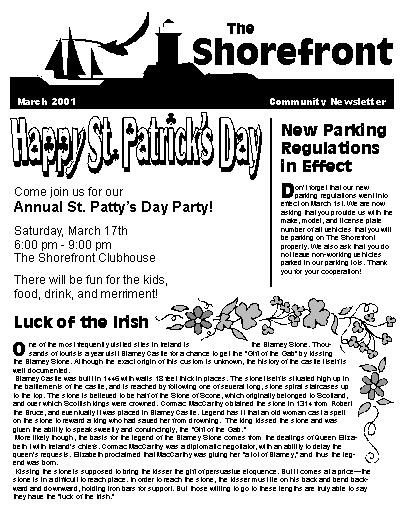
Before
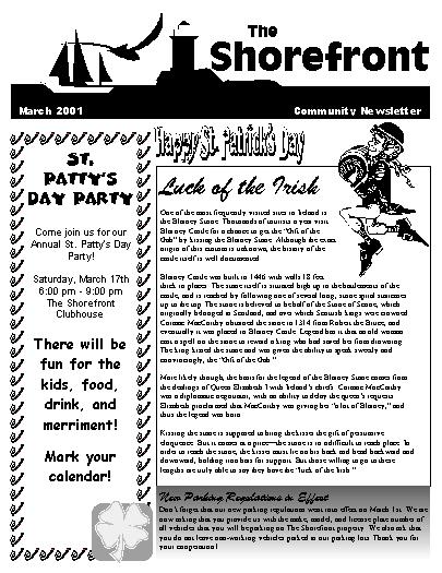
After